
")

How To Nail Your Instagram Aesthetic (In 1 Easy Step)

I know a lot of people who lust after the perfect Instagram feed. We all know someone has it, but how they got there (and stick with it) can be baffling. Even as a photographer, it took me a long time to understand what contributes to a consistent- and beautiful – looking feed. There are a few things you can do, but I want to make your life really easy and provide you with my top tip that will get things looking spiffy right away. So here’s how to make nail your Instagram aesthetic in just one easy step…
The Importance of Visuals
Visuals aren’t everything, but they do have a lot of power:
- They help your feed look professional and consistent
- They reinforce branding and can help keep your brand recognizable and top of mind for your ideal follower/client/customer
- They can attract your ideal audience
- And they can also invoke a type of feeling: if you want your audience to feel joyful or inspired, or maybe more calm, peaceful, or reflective
How to Make Your Feed Consistent
You can achieve consistency and portray a feeling by looking at just one thing.
In my opinion, the most important step in nailing your Instagram theme is intentionally choosing the colour tone of your images and sticking with it (this is also called ‘white balance’ and the terms are used interchangeably).

The colour tone indicates what general hue your photos give off. On one side of the spectrum, it can be really cool (or blue) and the other side, really warm (or orange). You can also commit to a neutral theme, which means that your whites appear as actually whites and they don’t have a tint of blue or orange.
Choosing The Right Colour Tone
First, I want you to look at other feeds and see what you are attracted to naturally. Then take into consideration what you might be trying to portray with these colours. Here’s a guide to help:
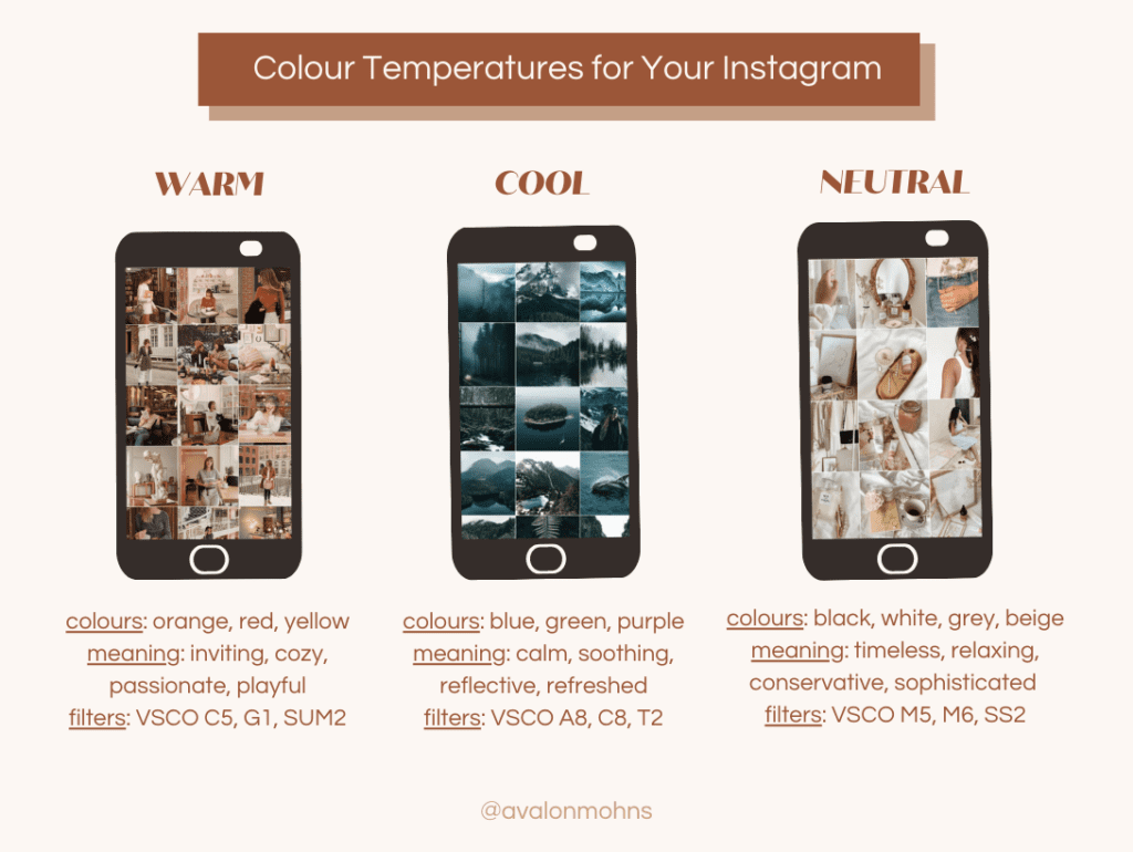
You might lean towards neutral if you already have branding colours in place that contain warm or cool colours, or you can edit your images to match.
For example, branding colours that are blue or green will clash next to photo that is very obviously warm. In this case, you would want to edit your photo cool to match or neutral.
How to Implement This on Your Feed
If you are using an editing app, look at the filters you constantly use. Determine whether they are warm, cool, or neutral.
If there is a mix, try to stick or one colour tone or ‘white balance’ as it’s sometimes called in editing apps. I recommend having 2-3 filters you use that are similar in colour tone because just having 1 is unrealistic.
Adjusting Filters to Match Your Tone
If your favourite filter is cool, but your theme is warm and you don’t want to let it go, have no fear!
My favourite filter in VSCO (A8) is actually quite cool so what I’ll do is increase the white balance more towards the orange end to warm it up a bit.
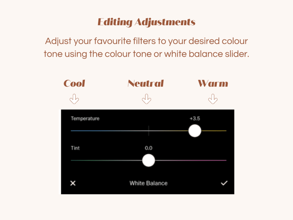
Every photo app I’ve come across has this functionality so find one that contains a few filters you like and get comfortable playing with the colour temp or white balance settings.
Knowing all this gives you control over your images instead of relying on a preset everytime. Presets will only look the same if you shot in the same spot with the same lighting for every single photo, so having some knowledge is key if you are taking and editing your own photos.
And that’s the magic of colour tone! If you’re a beginner at taking and editing your photos then this is a perfect place to start with designing a more put-together feed.
Wondering how to format your photos correctly for Instagram? My blog: ‘How to Format Images for Instagram’ will teach you how to avoid blurry photos and crop them just the Instagram likes it, so that your photos look top notch!
HOW TO TURN YOUR SELFIES
INTO BRAND PHOTOS
FREE GUIDE
Want to DIY your brand photos? Here are 10 photos you can easily replicate at home with a smartphone and a tripod!
uplevel your selfies
